
Try it Live
https://maqsoftware.com/resources/interactive-reports/route-mapComing soon to Microsoft AppSource
Key Challenges
• Generate performance ranges based on KPI data, and color routes accordingly.
• Allow users to compare the data of one airline against another.
• Create a visual/map with clean aesthetics that is easy to use.
Business Case
Travel companies rely on flight tracking data to determine carriers’ best performing flight routes. Support teams dedicate significant resources to monitoring route health. Many variables determine how well a route is functioning. To determine which routes offer the best travel experience, teams examine KPIs, including customer service, on-time performance, and airport locations. Gathering the necessary data requires teams to spend hours manually checking flight reports and highlighting data on maps.
Our client, a global leader in travel, needed an efficient way to track and display route performance. Although route map visuals exist, none directly incorporate KPI data to indicate route health in a single visualization.
Setup of the visual requires providing the appropriate KPI data. Users can configure which KPI ranges are displayed, assign colors to the ranges, and set solid or dashed lines. As shown below, the visual includes options to customize tooltips, path type, map positioning, map color, and animations.
Users can highlight routes by hovering over the route and view additional KPI information in tooltips. Route filtering is available by clicking on specific locations. Users can also pan, scan, zoom in, or zoom out to see a better view of specific routes or locations.
Our client, a global leader in travel, needed an efficient way to track and display route performance. Although route map visuals exist, none directly incorporate KPI data to indicate route health in a single visualization.
Solution
We created a custom Power BI visual that interprets KPI values and color-codes routes according to performance. At the user’s discretion, the visual can render map APIs from industry leaders Google, Bing, or OpenStreet.Key Highlights
• KPI value-based route highlights with seven color gradients.
• Tooltips with ability to showcase multiple KPI datapoints.
• Tooltip-enabled origin and destination icons.
• Animated path visualization for simulating flight track.
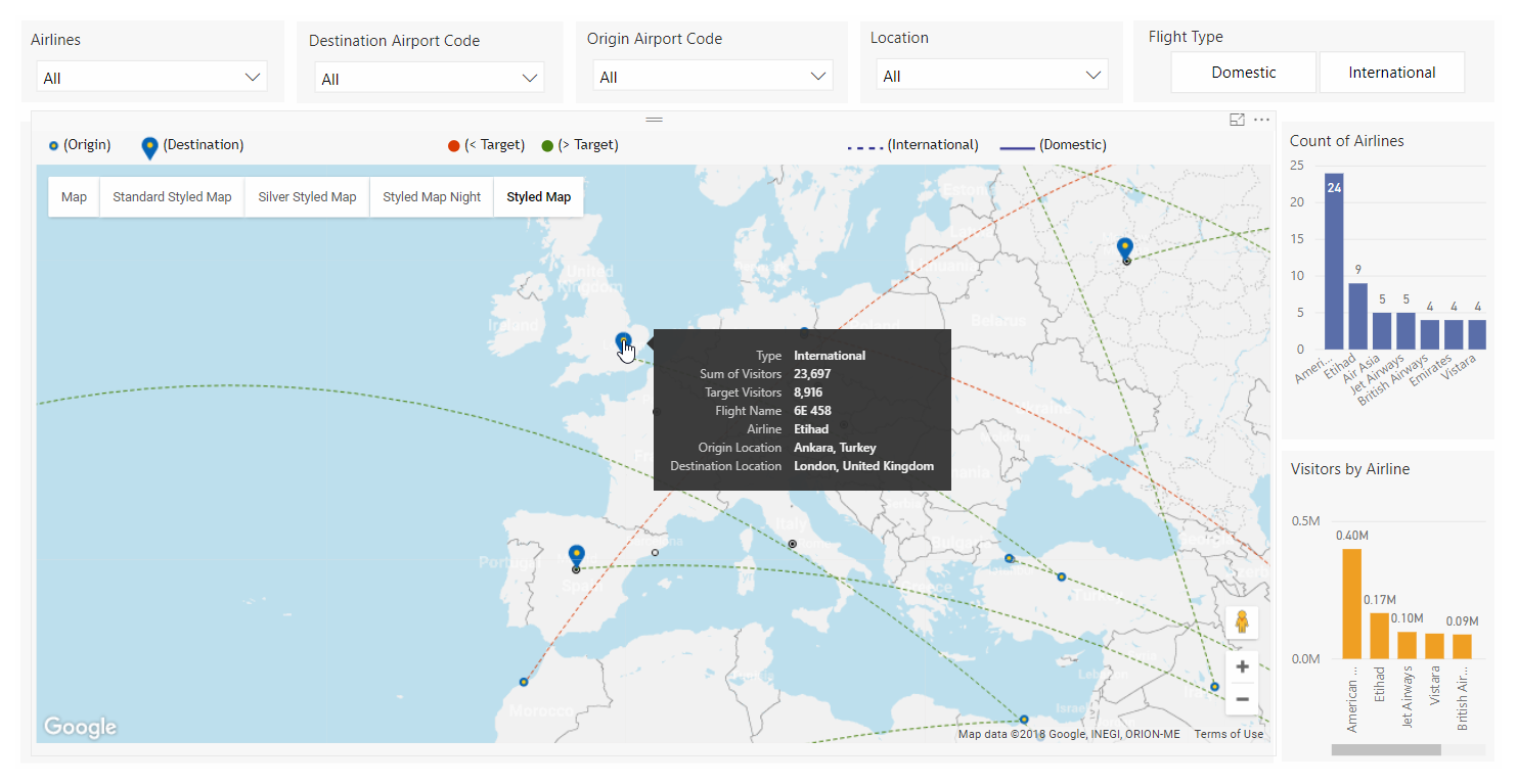 |
| Figure 1: Route map and tooltip with KPI data |
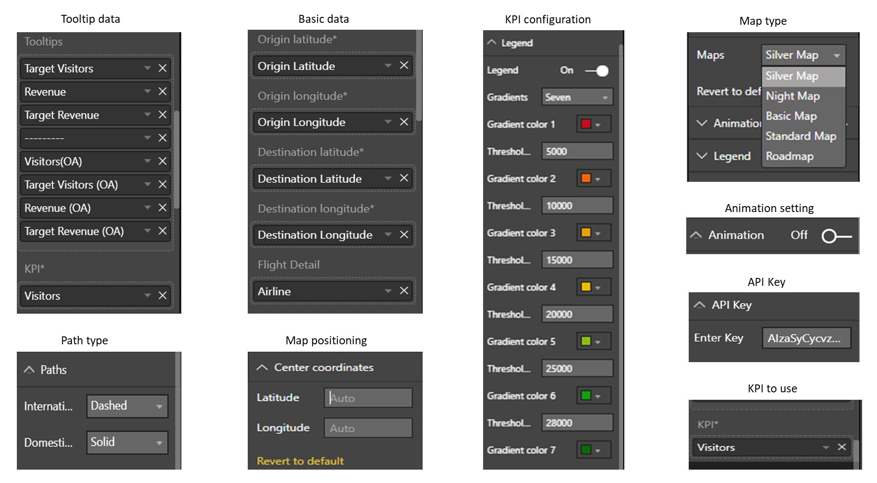 |
| Figure 2: KPI Settings and visual configuration |
Business Outcome
Our custom Power BI visual is a one-step, real-time solution for tracking route performance based on KPIs. The visual allows users to view color-coded flight routes and quickly determine which routes are performing the best. For more detailed information, users have quick tooltip access to route KPIs without searching through additional pages or visuals. Operations teams and travelers can now select flights quickly and with less effort.Outcome Highlights
• Reduced costs and complexity associated with tracking flight performance data.
• Improved customer service by creating real-time tracking of flight performance.
• Improved productivity through more effective reporting.